Saturday, September 30, 2017

Same Design, Two Different Looks!

Happy Saturday! 

Hopefully you get some time to kick back and relax this weekend. I've got some scrap time planned. I can already feel my blood pressure lowering. . . . 

I've mentioned many times that I use sketches from Scrapbook Generation when I scrapbook. They help me plan my layouts as far as photo size and placement. I create the color scheme/theme and add my own personal touches. There is so much versatility when you use a sketch as the following two layouts demonstrate.


Disney Cruise Album 2016

This layout shows some of the candid photos we took on Formal Night. I knew I had a lot of vertical photos I wanted to display so I looked for a sketch that would showcase more vertical than horizontal photos. The original sketch called for a 4x6 journaling block, but in this layout the pictures spoke for themselves, so I swapped it out for another photo.


Spring 2012 Album

This is a layout I did in 2012 and shows all the fun Zach had with an empty diaper box. Why he was wearing a winter coat on the first warm day of spring, I don't know, but he was having a blast! I followed the sketch exactly and included the journaling block.


The two layouts have their own looks and personality, but they started from the same sketch. This is a huge time saver when you have lots of photos to scrap. Sometimes I find a sketch I like and use it multiples times in the same scrapping session - I just make sure any "copy cat" layouts don't end up in the same album!

Give it a try sometime! Happy Scrapping!

Friday, September 29, 2017

A Lazy Day


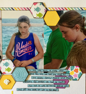
I love capturing the everyday moments of life – not just the birthdays, Christmases, graduations, but the little things that make up our lives. I took these photos during our Disney Cruise, and they document real life – one tired family.

We had just been swimming with the Sting Rays in Grand Cayman. We were on the ferry headed back to land. It was hot and we were all tired and sweaty. I noticed that everyone was quiet and I think Alyssia fell sound asleep sitting up!

One thing I noticed when I got home is that in one of the pictures, Zachary is covering his ears. The engine was loud and rumbling and all the noise and sensory input was just a little too much for him. Zach has sensory issues – he was diagnosed with Sensory Processing Disorder (SPD). One of Caleb’s occupational therapists picked up on the fact Zach was struggling with some issues. He was a little wild and crazy and seemed to need to play rough, which she explained was his way of getting the sensory input he needed.

When he was three years old we took him to be evaluated, and although he had some autistic like characteristics, they never placed him on the spectrum . . .  but they did say he had a combination of SPD and ADHD. He began speech therapy and occupational therapy and started school year-round at a specialized pre-school.

He was seven when these photos were taken and he has made tremendous progress. When he was younger he would have never been able to handle being in a crowded situation, contained on a ferry. But he has coping mechanisms – like covering his ears, closing his eyes, swaddling up in blankets, laying on the floor on his stomach, etc. He’s worked very hard and come a long way and I’m so proud of him! This picture of Zach might not have ever caught your eye as something significant, but to this mommy it was just another everyday moment that makes up my life and reminds me to count my blessings!


Scrapbooking Tips:
Once again, I used a Scrapbook Generation sketch to create this layout and I was excited to try a new shape on my layouts and pulled out my hexagon dies from The Stamps of Life. Using my dies and Sizzix Big Shot die cutting machine I was able to turn scraps of paper into a beautiful layout.

I popped up some of the hexagons to add dimension along with adding some shell brads from Doodlebug Design. I also tried to overlap some hexagons on the pictures and then added journaling strips on top of the hexagons to create visual interest. I think overlapping various elements on a scrap book page really helps to create an eye-catching design.


I typically don’t lay out my titles on a straight line, but I used my journaling template, traced a line in pencil which I carefully erased once the stickers were in place.

Title Treatment

Dimensional Hexagons

The journaling strips overlap some hexagons and lay under others.

Thursday, September 28, 2017

Beach Bums


Oh, this layout brings back some vivid memories. When I showed the finished pages to Jim, Alexis, and Alyssia they all said the exact same thing, “I can still hear that BONG!”


We were in Cozumel, Mexico at Discovery Cove and we had the amazing experience of swimming with dolphins. I still have not scrapped those pictures because it was so phenomenal an experience I want to make sure I have the *perfect* layout, papers, embellishments, etc. All of us interacted with the dolphin and everyone but Zach swam with them. It was definitely a memorable day!

After the dolphin swim, we got to relax on the beach and in the pools there until the buses came to take us back to our ship. We passed the main entrance to the beach and saw this amazing dolphin sculpture. It really was beautiful – showing a group of dolphins jumping up out of the water and it created a perfect photo op.

A lot of people had the same idea we did and we had to wait a couple minutes for our turn to take photos – and we were patient because we knew we wanted a few different poses. Now, if you know my little Zach Attack, you know that he really lives in his own little world. While we were waiting, he was watching kids play around in the pool and fountains. As we moved up to the sculpture we noticed Zach was still fixed in place not paying attention. When he finally did start moving to us, he was in a daze, keeping his eyes on the pool, and he walked directly into the sculpture!

Fortunately, the dolphins were hollow, but Zach hit his head hard enough that a metallic “BONG” echoed through the air, even drawing the attention of people nearby. Zach refuses to cry in front of people but because of the pain of hitting his head and the embarrassment of doing it in front of an audience, the poor kid teared up, and he needed some Mommy hugs to make it all better.
It was sad and funny all at the same time, and every time any of us look at the photos we remember that sickening sound!


Scrapbooking Tips:  


I absolutely LOVED these sea creature stickers in Doodlebug's Under the Sea paper collection. So I used adhesive foam to make them dimensional and decorated with epoxy dots. 

Wednesday, September 27, 2017

Best Buddies


This is one of my favorite pictures from 2014! That was such a painful year of firsts for me, moving on without Dave. I felt like I was just existing, going from one day to the next. Most days I was numb, and other days I missed Dave so much it would feel like I could barely breathe. Without a doubt, the boys kept me going. I would look at them and remember that they were Dave’s living, breathing legacy and I would determine again that I couldn’t let Dave down in this area. His boys were the love of his life and it was up to me now to raise them to be like their father, and remind them about their Daddy. Not a small task!

We were given a week at a Christian camp, Camp of the Woods, in Speculator, NY. I didn’t feel like going, but was so glad we went because the boys had an absolutely FANTASTIC time! Our cabin faced the lake and we enjoyed this beautiful view.

I love this photo so much because all I said to the boys is, “I want to take your picture here,” and Zach, completely unprompted, threw his arms around Caleb. Although the boys were always close, after Dave’s death they were inseparable. It was if as long as they were together, everything was ok, and in spite of the pain and grief, they were smiling happy boys. With these two in my life how could I not smile and move forward?


Scrapbooking Tips:

Because I loved this picture so much I gave it a full layout, and I went all out! It was later published in Scrapbook Generation’s Create magazine.

One area that took a lot of time and attention was the banner border on the bottom of the photo. It always takes some time to cut out and ink the banners, but one advantage of this type of embellishment is I got all the paper from my scrap pile. I always struggle with placing the banners on the page in a way that looks good. Two things that I have learned to do are cut the banners in varying widths and lengths and then layer them. This will give the border a more dimensional look.


Another element I’ve really enjoyed experimenting with is adding stitching to my pages. A lot of the 
sketches I use call for stitching and as much as I like the look of it, I don’t always take the time to add it.


One technique I’ve learned over the years, which I tend to use a lot, is to turn my stickers into 3-D embellishments by adhering them to the layout with adhesive foam squares instead of placing the sticker directly on the layout. It’s also a great way to create layers with stickers and add some extra pop to the page. 


Journaling:


Monday, September 25, 2017

Ohana Means Family


Our family has changed drastically since my last entry! God has abundantly blessed my boys and me and we doubled in size! Last October I married a wonderful man, Jim Bleau, who has two amazing daughters, Alexis and Alyssia. I marvel at God's goodness and provision for me, and have to wonder if during the dark depressing times where I have been broken and cried myself to sleep, God was trying to whisper, "Just wait until you see your next chapter. I'm not done writing your story."

While we have "blended" our family and move forward as one, I find my passion for scrapbooking reigniting. Although we carry the scars of everything both of our families have been through, I can honestly say that we smile a lot more! I find us laughing and looking forward to the future again, but at the same time remembering and honoring Daddy. I look through the pictures that have been too painful to scrapbook, and even though they may still bring a tear, I'm ready to remember all the good and fun times. 

To get back into my blogging habit, I picked out a layout I did this past summer. Before Jim and I married we wanted to create some memories as a new family, and we took the kids on a Disney Cruise. What an adventure that was!! (More layouts to follow!) We had adjoining cabins with Jim and the girls on one side and the boys and I on the other. It didn't take long before all the kids were coming and going back and forth like one big happy family. People we met would not have guessed we were a blended family!

Shortly after embarking the ship, the kids spotted Stitch from the movie Lilo & Stitch. That had been a current favorite of Zach's and he kept repeating a line from the movie, "Ohana means family!" When I got home and started putting layouts together that line literally jumped out at me - we were family. These were the boys' new sisters, my step-daughters! I looked down at the photo of  four happy, smiling faces and thought, "Yeah, we are family . . . " 


Scrapbooking Tip:

I love layouts where I can use any of the scrap paper in my stash and this was one of those layouts! I used a sketch from Scrapbook Generation and loved how the background was composed of thin strips. I was able to use scraps from other layouts I had already done for this album so it coordinated beautifully. 

I wanted the title to stand out because of the significance and special meaning to me, so I used one of my Sizzix dies from The Stamps of Life to create a background for it. Without the bright pop of yellow the letter stickers blended into the background. I also added a fun stitched border to complete the look and was pretty happy with the results - but even happier with the smiles in the picture!

y

We Love Candy

Who doesn't love candy? My kids have inherited their mom's sweet tooth. Although, as I've matured I forgo the sour patch kids...